
Checkbox field
Advanced Features of the Checkbox Field in FLEXIcontent
The Checkbox field in FLEXIcontent is a key element that allows multiple selections within articles. It is fully configurable and offers great flexibility for data input, display, validation, and filtering.
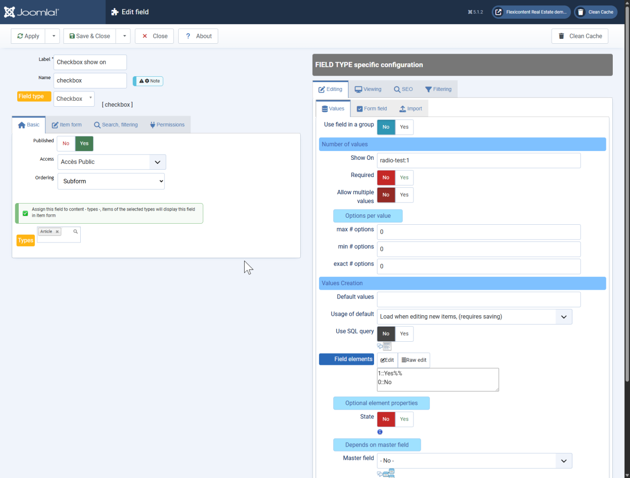
1. Configuration and Value Management
1.1 Editing and Input Options
The Checkbox field allows users to select one or more values depending on the predefined options. Several parameters allow customization of its behavior:
- Maximum and minimum number of selectable options: It is possible to restrict the number of options a user can select.
- Values per row: To optimize display, multiple values can be arranged in a single row.
- Adding values: Users can add new values either inline or at the bottom of the list.
1.2 Defining and Managing Values
Checkbox values can be defined in different ways:
- Static values: A predefined list of values can be manually entered.
- Dynamic values via SQL: The list of options can be dynamically generated using an SQL query. This allows, for example, retrieving a list of users or categories based on context.
- Default values: Preloaded values can be set when creating or editing an article.
1.3 Dependency on a Master Field
The Checkbox field can be linked to another field, known as the master field. In this case, the available options in the dependent field are dynamically updated based on the selection in the master field (e.g., a list of cities based on the selected country).
2. Display and Visual Customization
2.1 Value Presentation
The Checkbox field allows customization of how selected values are displayed:
- Label display: Checkbox labels can be displayed in different ways (as text, icons, or both).
- Adding images or icons: Each value can be associated with an image or icon for better readability.
- Displaying non-selected values: It is possible to show all available options while visually graying out unselected ones.
2.2 Content Formatting
FLEXIcontent provides advanced layout options:
- Adding text before and after each value: Allows adding prefixes and suffixes to displayed values.
- Custom separators: Selected values can be separated by spaces, commas, line breaks, or custom characters.
- List display: Selected values can be structured into numbered or bulleted lists.
2.3 Export and Compatibility
Checkbox field values can be included in CSV exports, either in raw or formatted versions. An option is also available to strip HTML tags from exported values to prevent display errors.
3. SEO and Social Media Integration
3.1 SEO Optimization
The Checkbox field supports microdata tagging, allowing search engines to properly identify selected values. This feature enhances page structuring and indexing for better search engine visibility.
3.2 Using Values for Social Media
Checkbox field values can be used to generate metadata for social media platforms. For example, they can serve as tags or categories to help classify content shared on Facebook and Twitter.
4. Advanced Filtering and Search
4.1 Creating and Displaying Filters
The Checkbox field can be used to refine article searches within FLEXIcontent. Multiple display formats are available:
- Dropdown list
- Radio buttons
- Multiple checkboxes
- Tag-like selector
4.2 Advanced Filtering Options
- Sorting filtered values: Displayed values can be sorted in normal or reverse order.
- Value comparison: Values can be compared as alphanumeric text, integers, or floating numbers.
- Faceted Filtering: Filters can dynamically adapt based on other active filters, improving the user experience.
4.3 Dynamic Filter Display
The Checkbox field supports dynamic filtering, where available options change based on previously selected filters. Additionally, it is possible to display the number of matching articles for each filter option.
The Checkbox field in FLEXIcontent is a powerful tool for managing multiple selection options. With its extensive customization options, it enables efficient value management, optimized display, and advanced filtering and SEO capabilities.
Last FLEXI-site